Unlocking Software Quality with Test Metrics in Testing
Discover the essential test metrics in testing that drive quality and accelerate releases. Learn to measure what matters for your QA and development teams.
Discover metrics for qa that reveal how testing adds value, not cost, with actionable insights and clear improvement paths.
Automate and scale manual testing with AI ->
Think of QA metrics as the vital signs of your software development process. They aren’t just numbers on a dashboard; they’re the critical data points that tell you whether your project is healthy or heading for trouble. For engineering leaders, they’re like a pilot’s cockpit instruments—essential for navigating the complexities of a release cycle safely and efficiently.
Let’s be honest: without data, any effort to “improve quality” is just a shot in the dark. The old saying, “what gets measured gets improved,” is the absolute truth in software engineering. When you translate a vague goal like “better quality” into hard numbers, you stop treating QA as a cost center and start seeing it for what it is: a strategic driver of value.
This data-first mindset lets you make sharp, informed decisions. You can spot bottlenecks before they become roadblocks, allocate resources where they’ll have the most impact, and ultimately, ship better products faster.
The industry is catching on, and fast. The global market for software testing and QA is set to explode, projected to more than double from USD 50.7 billion in 2025 to a staggering USD 107.2 billion by 2032. This isn’t just a trend; it’s a massive shift driven by the world’s demand for rock-solid software. That makes the metrics we use to measure reliability more critical than ever. For a deeper dive, check out the full market analysis of software testing services from Coherent Market Insights.
So, where do you start? A powerful way to think about QA metrics is to group them into three core pillars. Each one helps answer a fundamental question about your process, giving you a complete picture of your engineering health.
Let’s break them down in this table.
| Metric Category | Core Purpose | Key Questions Answered |
|---|---|---|
| Quality | Measures the end-user experience and product stability. | ”How good is the product we’re shipping to customers?” |
| Efficiency | Measures the speed and cost of the testing process. | ”How quickly and effectively can we validate our code?” |
| Coverage | Measures the depth and breadth of your testing. | ”Are we testing enough of the right things?” |
By focusing on these three areas, you get a well-rounded view instead of optimizing for one at the expense of another.
A well-rounded QA strategy doesn’t fixate on just one of these pillars. Instead, it seeks a healthy balance, ensuring that speed (Efficiency) doesn’t compromise the user experience (Quality) or leave critical gaps (Coverage).
Understanding these pillars is the first step toward choosing the right set of metrics for your team. From there, it’s all about building a culture that values data. If you’re ready to take that next step, learn how to cultivate a healthy metrics culture in your organization.
When it comes to QA, you can measure dozens of things. But drowning in data is just as bad as having none at all. The key is to focus on a handful of metrics that give you a true, actionable picture of your quality process.
Think of these six metrics as the vital signs for your entire engineering lifecycle. They cover everything from how well you’re testing your code to how stable your product is after release.
This framework shows how they all fit together, balancing the core pillars of Quality, Efficiency, and Coverage.
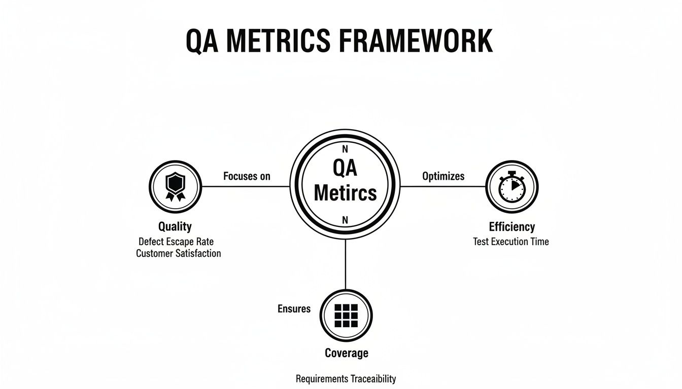
As you can see, you can’t just chase efficiency without thinking about quality or coverage. A healthy process keeps all three in balance.
At its core, Test Coverage answers a fundamental question: “How much of our app are we actually testing?” It’s a straightforward percentage that tells you how much of your codebase or your application’s requirements are exercised by your tests.
Now, “coverage” can be a loaded term. It might mean code coverage, which is the percentage of your code lines that tests run against. Or it could refer to requirements coverage—the percentage of user stories or features that have tests. The best teams track a bit of both.
Industry data confirms this focus is widespread; one report found that 56.4% of teams see test coverage as their most important metric, with automation coverage close behind at 40.1%. You can dig into more of these trends in ThinkSys’s detailed QA report.
How to Calculate It: (Number of Requirements/Code Lines Tested / Total Number of Requirements/Code Lines) x 100
A low coverage score isn’t just a number; it’s a huge blind spot. It means you’re shipping code that has never been validated, and that’s a massive risk.
If you had to pick just one metric to gauge the effectiveness of your QA process, this would be it. The Defect Escape Rate (DER) tracks the percentage of bugs that your team missed entirely and were only found by users in production.
A high DER is a serious warning sign. It means your testing strategy, whether manual or automated, isn’t catching what it should. This directly impacts user trust, drives up support costs, and pulls developers away from building new features to fight fires.
How to Calculate It: (Number of Defects Found in Production / Total Number of Defects Found) x 100
Let’s say you found 100 bugs during a release cycle, but customers reported another 15 that you missed. Your DER for that cycle would be 15%.
Bugs will always find a way to slip through. The real question is, how fast can you fix them? Mean Time to Resolution (MTTR) measures the average time it takes from the moment a bug is reported to the moment the fix is deployed.
This single number tells you a lot about your team’s agility and the health of your entire debugging and deployment pipeline. A long MTTR can point to bottlenecks like:
Driving down your MTTR means customers see problems disappear faster, which is a direct improvement to their experience.
In the era of CI/CD, speed matters. Test Cycle Time is simply the total time it takes to run your entire test suite for a build or release.
If your tests take hours to complete, they become a major bottleneck. Developers wait forever for feedback, context switching kills productivity, and the whole release train grinds to a halt. The goal is to get this cycle time as low as possible without gutting your test coverage. This usually means optimizing slow tests, running tests in parallel, and beefing up your testing infrastructure.
How to Calculate It: Total time from the start of the test execution phase to the end.
A lean test cycle is what allows elite teams to release confidently multiple times a day—a huge competitive advantage.
The Test Pass Rate is exactly what it sounds like: the percentage of tests that passed during a given test run. It’s a simple, immediate health check for any new build.
A sudden dip in the pass rate is an immediate signal that something is wrong. It could be a major regression in the code or even a problem with the test environment itself. By tracking this trend over time, you can spot unstable builds early and stop them from ever reaching production. While 100% is the goal, the trend is often more telling than any single number.
Last but not least, we have the silent killer of test automation: Test Flakiness. This metric tracks the percentage of tests that give you inconsistent results—passing one minute and failing the next, with no code changes.
Flaky tests erode trust. When developers can’t rely on the test results, they start ignoring failures, and your automated safety net becomes useless. A test that passes 10 times and fails on the 11th creates noise and sends engineers on pointless investigations. Stomping out flakiness is non-negotiable for a healthy CI/CD pipeline.
You can delve deeper into these crucial metrics and more by exploring our guide on essential QA KPIs to benchmark your quality assurance process.
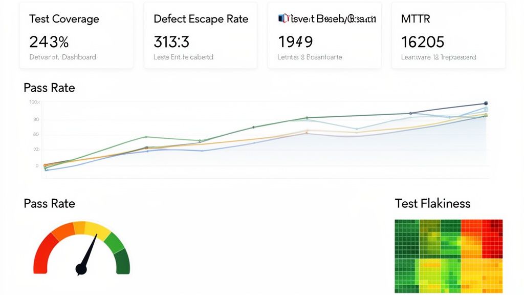
Knowing your key metrics is one thing, but bringing them to life is where the magic happens. A great dashboard doesn’t just display data—it tells a clear, compelling story about your quality process. It turns raw numbers into a shared language that gets developers, QA, and product managers all pointing in the same direction: shipping excellent software.
Think of it as the mission control for your engineering team. With a quick glance, anyone should be able to see the health of the current release, spot problems before they escalate, and celebrate improvements. The real goal here is to shift from reactive fire-fighting to proactive, data-informed decision-making.
This kind of visibility is what separates high-performing teams from the rest. It fosters a culture of accountability and makes quality a collective responsibility, not just a task siloed within the QA team.
Before you build anything, you need the right tools for the job. Your choice will likely come down to your team’s existing tech stack, budget, and how much customization you really need. Luckily, there are some fantastic options out there that can plug right into your data sources.
Here are a few of the most popular choices I’ve seen teams use successfully:
The key is to pick a tool that integrates smoothly with your current systems—think Jira for bug tracking, Jenkins or GitHub Actions for CI/CD, and whatever test automation framework you’re using. This tight integration is what makes automated data collection possible, ensuring your dashboard is a real-time reflection of reality, not a stale report.
A truly great dashboard is more than just a collage of charts; it’s a carefully designed narrative. The layout should guide the viewer’s eye from a high-level overview down to the nitty-gritty details, answering critical questions along the way. Your worst enemy here is clutter. Every single chart needs to earn its spot.
Here’s a blueprint for laying out an effective dashboard, grouping related metrics for qa to tell a coherent story.
Section 1: The Big Picture (Release Health) This section sits right at the top. It should provide an immediate, at-a-glance summary of the current release’s stability. It’s for anyone asking, “So, are we on track?”
Section 2: Deeper Quality Insights Here, you dive into the metrics that reveal how effective your quality process is over the long haul. This section helps answer, “Is our process actually getting better?”
Your dashboard should be a mirror reflecting your team’s processes. If a metric looks bad, it’s not a reason to blame anyone. It’s an opportunity to ask “why” and fix the system.
Section 3: Test Suite Health and Coverage This final area puts the spotlight on your testing assets themselves. It’s all about answering one crucial question: “Can we actually trust our tests?”
By organizing your dashboard this way, you create a logical flow that serves everyone. An executive can get the whole story from the top section in seconds, while an engineer can dig into the bottom sections to diagnose a specific problem. This is how you turn your data from a passive report into an active tool for continuous improvement.
Trying to gather data for your QA metrics dashboard manually is a surefire path to burnout and inaccurate reports. It’s like trying to fill a swimming pool with a teaspoon—it’s painfully slow, exhausting, and you’re going to lose a lot of water along the way. If you want a metrics program that actually works and doesn’t just create busywork, you have to automate the data collection.
This is where modern QA tools come in. Think of them as the automated plumbing that connects your test runs, code repositories, and bug trackers directly to your dashboard. This setup cuts out human error, frees up your engineers from soul-crushing data entry, and gives you a real-time, accurate picture of your project’s health.
Automation is taking over, and fast. We’re seeing a massive shift, with 77.7% adoption of AI-first quality engineering strategies becoming the new normal. And it’s not just hype; this approach delivers real results. High-performing teams have seen production incidents drop by a staggering 40% by using better data and dashboards. You can dig deeper into this trend with these insights on QA automation trends.
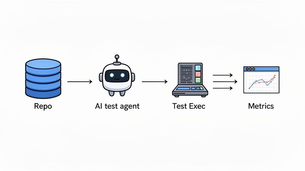
Platforms like TestDriver are leading this charge. It’s not just about making tests run faster; it’s about fundamentally changing how we create tests and harvest their results. Instead of a QA engineer spending hours scripting a complex end-to-end scenario, they can just give the tool a simple, plain-English prompt.
For example, an engineer could tell the AI: “Create a test that logs in as a premium user, adds three items to the cart from the ‘new arrivals’ page, applies a discount code, and completes the checkout with a test credit card.”
The AI agent takes that prompt, generates the necessary test steps, and runs the entire flow, capturing every result automatically. That single action instantly feeds data into several of the core metrics for qa we’ve been talking about.
So, how does a tool like TestDriver actually populate your dashboard with almost zero effort? Let’s use that checkout test as an example. When the AI agent runs the test, it generates a ton of useful data points that map directly to your most important metrics:
The real game-changer here is the impact on scale and speed. Because generating tests from prompts is so much faster than writing code, teams can expand their Test Coverage dramatically. You can suddenly cover more edge cases, different user roles, and complex workflows in a tiny fraction of the time it used to take.
This has a direct impact on your Test Cycle Time, shrinking it as more tests can be run in parallel without needing more people. By automating both test creation and data collection, you build a powerful feedback loop. Your team gets to spend less time on repetitive grunt work and more time analyzing the insights your metrics are giving you—driving a genuine culture of data-driven quality improvement.
Metrics are incredibly powerful, but they can be a double-edged sword. If you’re not careful, they don’t just give you a fuzzy picture of quality—they can actually hurt your team’s culture and bring progress to a grinding halt. The moment you treat a metric as a target to be hit, rather than a signal to learn from, you’ve lost. That’s how you get teams gaming the system instead of building great software.
The goal is never just to hit a number. It’s about understanding the story the data is telling you. A sudden plunge in your Test Pass Rate isn’t a failure to be punished; it’s a priceless early warning that something in your process needs a closer look.
One of the most common mistakes is chasing vanity metrics. These are the numbers that look fantastic on a PowerPoint slide but tell you absolutely nothing about your product’s real-world quality or your team’s effectiveness. The classic example? The misguided quest for 100% Test Coverage.
On paper, perfect coverage sounds like the ultimate goal. In reality, it pushes teams to write loads of low-impact tests just to pump up a percentage. This bloats your test suite, creates a maintenance nightmare, and drags down your Test Cycle Time—all without adding any meaningful stability. A test for a simple UI label gets the same score as one for a complex checkout flow, but their value couldn’t be more different.
What to do instead: Focus on risk-based coverage. Stop asking, “Did we test every line of code?” and start asking, “Have we bulletproofed our most critical, complex, and high-risk user journeys?” This approach funnels your testing energy where it truly counts, directly protecting the customer experience.
Want to kill a healthy engineering culture? Start using metrics as a weapon. If you judge a developer by the raw number of bugs tied to their name, they’ll quickly learn to avoid complex or risky features. Innovation grinds to a halt, replaced by a culture of fear.
The same goes for QA. If you reward an engineer based on how many bugs they log, you create an adversarial “us vs. them” dynamic with developers. Metrics should be a flashlight, not a hammer. They’re there to shine a light on problems in the process, not to point fingers at people.
To build a healthy, improvement-focused culture around your metrics for qa, the conversation has to shift from individual performance to system health.
It’s all about reframing the goal. Instead of chasing numbers that are easy to measure but hard to act on, you need to focus on metrics that inspire collaboration and genuine improvement.
| Common Pitfall (Vanity Metric) | The Healthy Alternative (Actionable Metric) | Why It’s Better |
|---|---|---|
| Number of Bugs Found | Defect Escape Rate (DER) | DER measures the effectiveness of the entire QA process, not just one person’s output. It’s about what slips through to users. |
| 100% Test Coverage | Coverage of Critical User Paths | This focuses your limited time and resources on what impacts users most, maximizing the return on your testing investment. |
| Individual Bug Counts | Team Mean Time to Resolution (MTTR) | MTTR encourages collective ownership and collaboration. The goal isn’t blame; it’s getting problems solved quickly as a team. |
| Strictly Meeting KPI Targets | Analyzing Trends and Anomalies | Trends tell a story about systemic issues and improvements over time, which is far more valuable than hitting an arbitrary number. |
By adopting these healthier alternatives, you can turn your metrics from a source of stress into a shared tool for continuous improvement. They become the starting point for productive conversations about making the entire development lifecycle better for everyone involved.
Let’s be honest, a one-size-fits-all dashboard is a recipe for disaster. When you cram every possible metric onto a single screen, it becomes a cluttered mess that helps no one. The secret to making metrics for qa actually work is getting the right information to the right people.
What a Product Manager finds crucial is often just noise to an SDET. And the nitty-gritty details an SDET obsesses over are way too granular for an Engineering Manager. By tailoring the data, you turn a passive report into a powerful tool that gets everyone aligned on what quality truly means.
Here’s how to break it down.
Engineering Managers are responsible for the team’s overall health and momentum. They need a 30,000-foot view to answer the big questions: “Are we building the right way? Can we ship with confidence?”
Their dashboard should focus on metrics that tell a story about process stability and team efficiency.
Software Development Engineers in Test (SDETs) are the ones in the trenches, working directly with the test suite every day. Their world is tactical and deeply technical. They need detailed, granular data to hunt down and squash problems within the automation framework.
An SDET’s dashboard isn’t about the big picture; it’s about the real-time health of the testing machine. They’re the mechanics keeping the engine finely tuned.
The metrics they live and breathe include:
Product Managers are the bridge between engineering work and business goals. They couldn’t care less about how a test runs; they want to know what the results mean for the customer. Their metrics need to speak the language of product value and user experience.
The data that truly connects with a PM includes:
Diving into a data-driven QA strategy always sparks a few questions. It’s natural. Getting these cleared up early on can save your team a lot of headaches and help you get results faster. Let’s walk through some of the big ones we hear all the time.
If I had to pick just one, especially for a startup, it would be the Defect Escape Rate. This isn’t just a number; it’s a direct reflection of what your customers are actually experiencing. When you’re fighting for every user and building your reputation from scratch, product quality is everything.
A low escape rate means you’re building trust and avoiding the costly, frantic scramble to fix bugs that have already made it out into the wild. For a lean team where every minute counts, that’s huge. It’s the ultimate litmus test for whether your entire QA process is working to protect your users.
You don’t need to obsess over every metric every day. The trick is to match your review cadence to the metric’s purpose.
Here’s a good rule of thumb:
Oh, absolutely. It’s a classic trap. We call it “analysis paralysis”—you get so bogged down in charts and data that you spend more time measuring than improving. Having a firehose of numbers is often just as useless as having none at all.
The key is to start with a handful of powerful metrics. Pick 3-5 that are tightly aligned with what your team needs to achieve right now, whether that’s shipping faster or squashing more production bugs. Get really good at tracking those and, more importantly, acting on them. Once that becomes second nature, then you can think about adding more. The goal is always to get insights you can use, not just to collect data for data’s sake.
Ready to stop guessing and start measuring? TestDriver uses an AI agent to generate and run end-to-end tests from simple prompts, automatically collecting the critical data you need for your QA metrics dashboard. Streamline your testing and get actionable insights today at https://testdriver.ai.
Discover the essential test metrics in testing that drive quality and accelerate releases. Learn to measure what matters for your QA and development teams.
Master data driven tests with our guide on setup, best practices, and CI/CD integration. Boost your test coverage and build more reliable software.
Explore the real differences in automation vs manual software testing. This guide covers when to use each, ROI, and how to build a winning hybrid strategy.
Build a reliable strategy for automated regression tests. Learn to prevent bugs, speed up releases, and integrate testing seamlessly into your CI/CD pipeline.
TestDriver uses computer-use AI to test any app - write tests in plain English and run them anywhere.